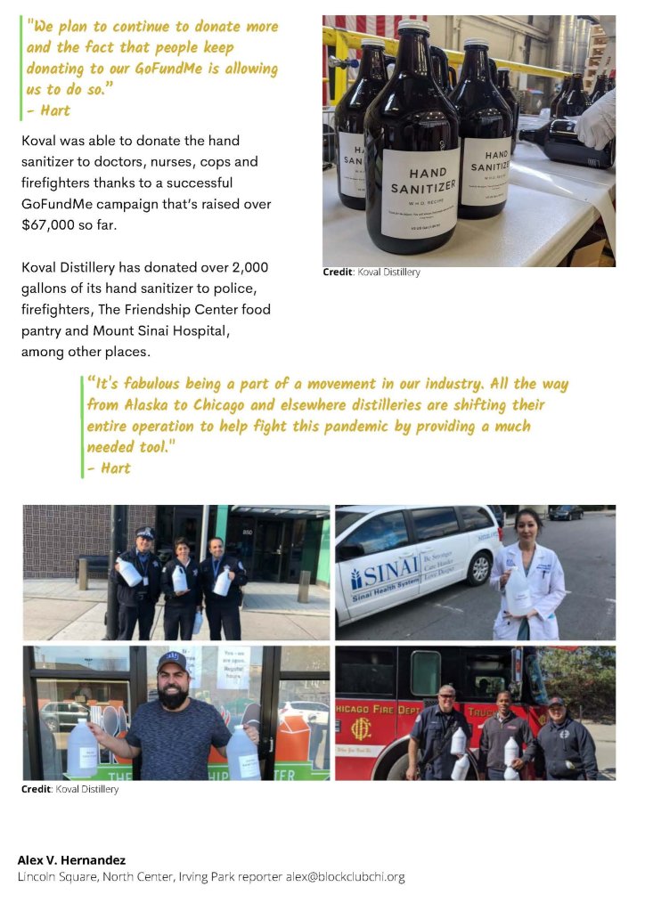
Koval Distillery Shifting Efforts During COVID
Role:
Designer
Date:
2022
Project Summary:
To select a visual article I felt could be improved and create a layout using topography and visual hierarchy as primary tools. The goal was to focus on headlines, impactful quotes and images to users.
The Challenge & Solution:
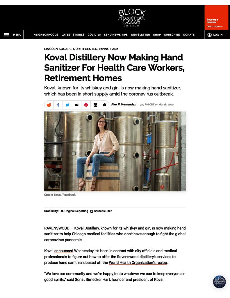
As a local source of pride, I took interest when I heard the distillery was producing hand sanitizer instead of the usual during the early stages of the COVID pandemic. The Koval Distillery was founded in 2008 by husband and wife, Dr. Robert Birneck and Dr. Sonat Birnecker Hart.
I do not know the original placement of the articles regarding the distillery’s production of hand sanitizer, but when I first read it on the internet, I was shocked. The story was such a phenomenal opportunity for promotion and marketing, demonstrating how they were helping their community, but the article was so plain. It did have a few beautiful photographs, but overall, it was incredibly monochromatic where it could have made such a larger and long-lasting impact for the company.
Numerous changes would make a large impact to improve the experience of reading this article, as well as make it more impactful in a promotional manner. The presentation of information formatting in the original article is very monochromatic, with minimal hierarchy of text – three levels to be exact.
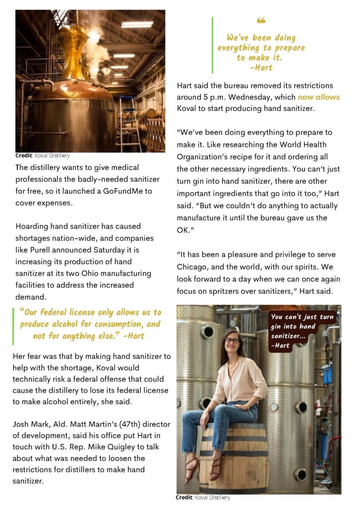
Results: After it was redesigned with the same content, it is a much more enlivened article that pulls the eye. There is always a need for visual weight and hierarchy, but given that this is not a data-heavy article, it is increasingly critical here to demonstrate information of higher importance according to Joel Marsh in his article of Visual Design Principles.
Also, with such minimal hierarchy and no use of color except the photos, those who are not able to see color or are visually impaired are at a disadvantage with this article. The text turns into a continuous stream of information, with no direction as to what is more or less significant without directing the eye with color. An increase in color, hierarchy, and information formatting would tremendously improve the impact this article could have, as well as its ability to be successfully, and impactfully, digested by the reader.
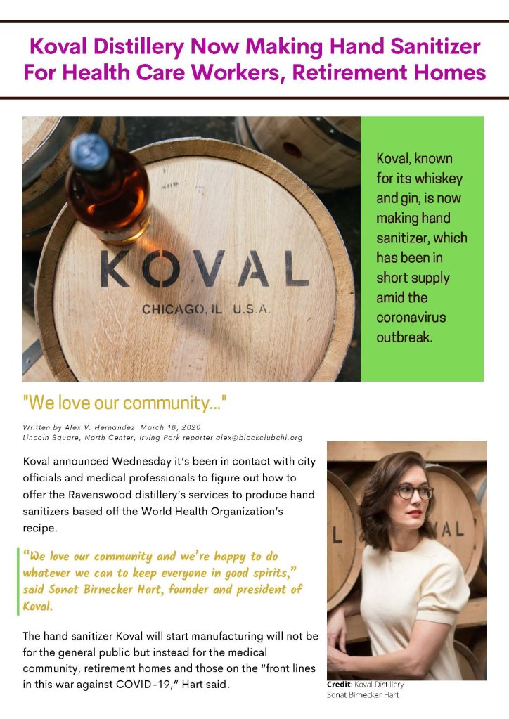
Original Article
Redesigned Artcle

Explanation of thoughts and process: https://docs.google.com/document/d/1EZjOrlH0Oiq9_vPGbeM3RWHhIKpktRdw34KUMiwU8_Y/edit
